Creating Mood with Color Gradients in Thumbnails
Introduction to Mood and Color Gradients
Visuals play a vital role in capturing attention and setting the mood of your content, which is why it’s crucial to understand how color gradients rest at the center of creating moods in thumbnails. The right blend and transition of colors can convey multiple emotions and tell a unique story to your audience. This guide will help you navigate the nuances of creating mood with color gradients in thumbnails.
Understanding the Basics of Color Theory
Before delving into creating mood with color gradients, it’s essential to understand color theory basics. Colors are not merely eye-catching, but they also influence human psychology. Different colors elicit different emotions and reactions. For instance, red can represent passion or danger, while blue often symbolizes tranquility or loyalty.
Regarding color gradients, it refers to the gradual blending of one color shade into another. It could be from one color shade to another or from one hue to a completely different hue. The idea is to create a smooth transition between colors, drawing the viewer into the image and creating a specific mood or feeling.
Tips for Choosing the Right Color Gradients
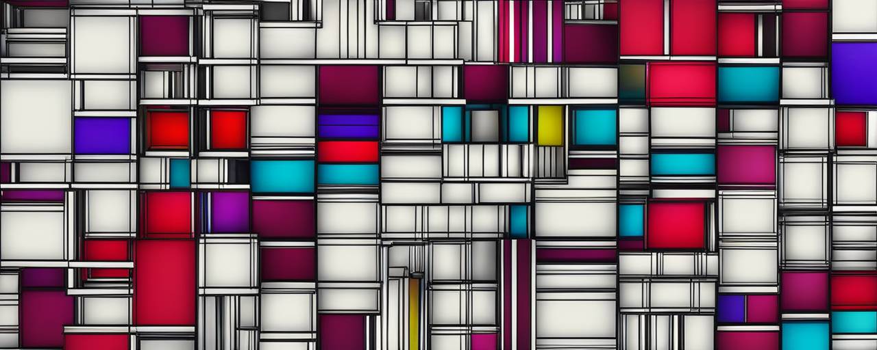
![]()
Not every color gradient will suit every project, so it’s important to select wisely. For instance, a vibrant and energetic gradient will work great for a fitness video thumbnail, but it might not fit well for a documentary about climate change. Here are a few tips to follow:
1. Understand your content: Your chosen color gradient should align with your content. A misaligning color gradient can confuse viewers.
2. Consider your target audience: Different colors appeal to various demographics. Figure out what colors would resonate most with your target audience.
3. Follow your brand colors: If you are working on ad creatives or brand-related videos, make sure that your thumbnail aligns with your brand’s color scheme for consistency.
1. Recognize the Emotion behind Colors: Colors often evoke certain emotions. For example, red can symbolize passion and excitement, whereas blue is associated with tranquility and stability. Before choosing a color gradient, evaluate the kind of emotion you want to trigger through your content. 🎨
2. Incorporate Trending Color Gradients: If you want your design to stand out, consider using the trending color gradients. Color palettes and gradients are constantly evolving, and keeping an eye on the latest trends can ensure that your creation is up-to-date and visually appealing.
3. Don’t Overdo Gradients: While it’s super cool to integrate gradients into your design, overdoing it can make your content look chaotic and hard to digest. Try to maintain a balance and don’t overcomplicate the design. You want your audience to engage with your content, not get distracted by it.
4. Test Multiple Gradients: Use various design tools to experiment with different color gradients. This will help you compare how each gradient looks with your design and select the one that complements your content the best.
5. Consider the Readability: Make sure that text or other important details in your design do not get lost in the gradient. You want your audience to be able to clearly read and understand your content. If the gradient is too distracting or makes elements hard to read, it’s probably best to switch it up.
6. Consider the Colors in Images: If you are using images in your design, take into account the colors in your images when selecting your gradient. A gradient that works well with your images will help to create a more unified and professional looking design.
7. Maintain Consistency: Consistency in color can help strengthen your brand and make it more recognizable. Using the same or related gradient themes across different design projects can improve your branding and increase its recognition.
8. Use Gradients with Purpose: Rather than just using gradients because they look cool, think about how they can improve your design. Gradients can add depth, help to create focal points, or enhance the overall aesthetic of a design.
By considering these tips and putting thought into your gradient selections, you’ll be able to create strong and impactful designs that truly resonate with your audience. Remember, color gradients are a powerful tool in your design arsenal, use them wisely!
Creating Mood with Color Gradients using Thumbmachine
Thumbmachine has revolutionized the way we design thumbnails, thanks to AI technology. Follow these steps to create mood with color gradients:
1. Upload your image: Start by uploading the image you want to transform into a thumbnail.
2. Choose your gradient style: Thumbmachine offers different gradient styles. Experiment and choose the one that best fits your content.
3. Select your colors: Choose your gradient colors. You have the freedom to manually select the colors or let the AI suggest colors based on your image and setting.
4. Adjust the gradient: Manipulate how and where the colors merge. For dramatic effect, make the color change sharp and quick, whereas for a subtle mood, make it slow and gradual.
Finding Inspiration for Your Color Gradients
If you are finding it challenging to decide which color gradients to choose, don’t worry 😊. You can always seek inspiration from existing artworks, nature, and even social media platforms. Noticing how colors interact in your daily life can give you a sense of what kind of gradients evoke what kind of emotions.
Conclusion
Crafting an engaging mood with color gradients in thumbnails is an art that involves understanding the basics of color theory, knowing your content, considering the target audience, and getting creative with your application. Using tools like Thumbmachine can simplify the process, allowing even those with no design experience to create stunning and mood-evoking thumbnails. Practice and explore with different color gradients, and soon enough, you’ll be a pro in creating impactful moods for your thumbnails.
–Jada
Tagged as:How to Use Thumbmachine Templates for Quick Designs When it comes to creating striking thumbnails or ad creatives, Thumbmachine is an intelligent tool that can make your task significantly easier. It is not just about aesthetics; good ...
How to Experiment with Typography in Your Thumbnails Typography is a powerful tool for attracting attention and conveying a message visually. When used effectively, it can significantly impact the overall aesthetic of your video thumbn...